OMG!!!! I LOVE this dress...I found it on one of my new favorite sites "Just Cool Design"! Sheer inspiration...
Showing posts with label Design Ideas. Show all posts
Showing posts with label Design Ideas. Show all posts
Friday, July 17, 2009


Sunday, December 28, 2008
Once you go black...
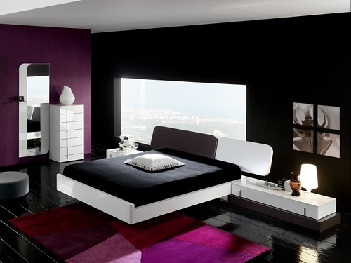
Do you ever go back; to another wall color, of course. I've gathered several images from the web, and the rooms below belong to some very bold individuals who decided to slip their decor into something more comfortable yet stylish and very out of the ordinary. It's been said that painting walls in a dark hue makes a room feel like a cocoon, enveloping you in comfort, I think black could be my comfort zone. I guess I can say I wouldn't be quick to go back to anything else.




Give your design a boost...with caffeine

Who knew all the great things you could do with leftover coffee and tea!? I was watching television the other day and I heard someone say a good way to stain light wood (such as pine) is with leftover black coffee! Not only is it a great way to re-purpose java but it's also all natural so that means it's great for the environment, I've heard it's best to use as stain when the coffee is a little cold. Of course that sent me on a search, so here are some other uses...


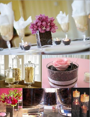
3. Finally don't forget all the great ways to display and store coffee beans. Fill an apothecary jar with coffee beans and leave it on the kitchen counter as storage and decoration, or fill the empty space between your candle and glass candle holder with coffee beans; you could also use the beans as a filler when doing a floral arrangment for a really unique look.
1. Use coffee or tea to dye and stain fabrics, shabby-chic design (as shown below) is a great example of a setting in which the method would work well with the color pallette.
2. Use coffee or tea to dye and stain paper or canvas to create art and accessories. I think it would be a great look if you were take varying sized strips of paper and dye them in different shades with coffe and tea, arrange them in a large white frame and hang it. I also thought the portrait below was interesting.
Now if you really want to go all out, check out Filipino artisit Sunshine Plata, all of her works are created with coffee.
3. Finally don't forget all the great ways to display and store coffee beans. Fill an apothecary jar with coffee beans and leave it on the kitchen counter as storage and decoration, or fill the empty space between your candle and glass candle holder with coffee beans; you could also use the beans as a filler when doing a floral arrangment for a really unique look.
4. Don't forget to use that old, cold coffee as stain for light wood tones!
Tuesday, February 5, 2008
It's been a long time coming...
 but a change has came and I've finally got some pictures I feel are suitable to post! There are still a few changes I'd like to make, but I'm excited and I feel really productive when I come to work in this room (which was the whole point).
The picture shown above is of two frames that sit on my desk that really motivate me, they are hue's logo and a pop art picture that I made; it's FULL OF COLOR, which I feel is my biggest inspiration.
 The picture above is my desk/table, I needed something large enough to have an accurate amount of workspace so we bought a cosco folding table and jazzed it up a bit! I love to recruit help so my little sister painted the surface of the table with the yellow paint used on the chairs. I'd seen these panels in a fabric store that appeared to have a print similar to damask but instead of buying them I went to the hardware store and bought three wood panels...
Painted them black...

Drew and etched out a stencil, then painted the stencil onto my boards.
 I must say I was very pleased with the outcome of the boards. Next I needed plenty of storage for my sewing machine, project samples and hardware so I sewed this skirt for the table and added black satin ribbon to finish the edge and there's a TON of stuff under that table, which made it an even better buy!
 Of course roomie couldn't be left out, so this is her work area shown above. We had to add more color so I dissected a picture of us that I'd changed to a black a white photo, added some pops of color and mounted it to the wall (below).
 We found this great chrome hand statue that I think sums up the feel of the office...A OKAY!
 Last but not least, I've said all along that the office had to function as a guest bedroom. I played with the idea of several things on the wall and ended up going with a pattern that accented the "vaulted" ceiling. We also decided instead of a traditional looking bed we would convert this day bed into a lounge sofa, it sits pretty low to the ground but it's nice and quite comfortable...we've even had a guest to sleep here already!
A couple of things that didn't make it into the photos were the window treatments (you can glimpse in the photo above) but they are three sheer panels, two of which are the black and white pattern and one yellow sheer between them. We also have a black shag rug to break up some of the blah berber carpet. All that's left now is to mount the tv to the wall, or find an eclectic television stand and maybe a couple of floor pillows.
Sunday, January 27, 2008
Opposites Attract!
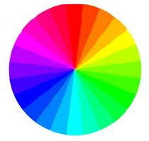
According to color theory, colors which are directly opposite from each other on the color wheel come together to form a harmonious color combination known as a complementary scheme. I've found photos of some spaces that execute that concept beautifully, but first check out an example of the color wheel to see if there's a combination you like.
This first bedroom has shades and tints of red, pink, orange, and green. It reminds me of a delicious sorbet, and the look that's pulled off is quite yummy! The space also features a headboard that's reminiscent of a technique called trompe l'oeil (French for "trick the eye") in which an item is painted to look sort of three dimensional. This headboard is not quite as elaborate as most trompe l'oeil examples but pretty none the less.

Here are two more examples of the red/green complementary scheme...


Next lets explore the combination of violet and yellow, I must admit it's not my favorite but I think the designers who put together the rooms below did an excellent job. The first bedroom features rich eggplant purple walls with hint's of yellow for a tropical feeling. The wood used in this room also has strong yellow undertones adding to the complimentary color scheme.

The second bedroom featuring violet and yellow combine the colors in a more subdued manner, using lavender and a pale yellow almost taupe color.

Finally we have the blue-green/red-orange combination which I think is very fab! The first room is so nice I had to show you twice (two different views of the same room).

 This last room was featured in Domino's magazine and was submitted by one of their readers...I love it!
Images courtesy of Domino, Sunset, and House Beautiful.
We'll continue our journey through color theories with more posts throughout the week, until then...happy decorating!
Wednesday, January 23, 2008
Handpainted Chairs
As many of you may know my roommate and I recently relocated to a 3 bedroom condo from a two bedroom townhouse, so that we could convert the extra bedroom to an office for Hue! I'm pleased to announce that we have almost finished the room, and I wanted to give a sneak preview of the space.


In the quest to find chairs to go into the room we wanted something eclectic and unique, therefore we began scouting all thrift stores for a traditional style chair that could be converted into the perfect accessory for the room. We found these great chairs pictured below, they may look a little funky now, but they get even funkier (good funky; lol)
The color palette for the office is black, white, and golden yellow. We'd already decided that we'd use a damask print as the pattern in the room. I hand painted each chair (with about 5 coats) of yellow paint, and recovered the seat cushions, it only took about two days, and that's including letting the paint dry, while I worked on other projects.
So check out the results...what do you think of the new twist on these traditional chairs?


I'll post even more pictures later this week, as I said this is just a sneak peek stay tuned for the entire room reveal.
How about one more teaser...

I'll show you where this project previewed above, found a home in the space.
Wednesday, August 29, 2007
Add the Z Factor
Check out these photos; they all have the Z factor...
 Who would have thought, "Bubblegum" pink mixed with cobalt blue and sophisticated furnishings makes for a very unique look. Throw in the zebra skin rug...and that's what I call a BOLD yet elegant entry-way.
 Who says you can't mix all your favorite things in one room? White furniture, warm fabric tones, and cool avocado green on the walls. Bring on the zebra, and you've got one eclectic bedroom.
 What a love story; Curvy furnishings mixed well with clean lines. Tradition falls for modern and black revisits white, when the zebra hits the floor. The glass table says, "I know I could have covered this up, but I want you to see it all"!
  What is that...velvet?("Coming to America" fans can appreciate that LOL) Not too much fuss, just some wall paper, lemon trees, and bold color. Lay out the zebra rug to "anchor" it all and it's dinner for three in this retro dining area.
No matter the style the equation is simple;
if you want a room that = BOLD and FUN + ZEBRA !
Rooms Courtesy of Laura Day Designs, House Beautiful, and Coastal Living
Wednesday, August 22, 2007
Lovebirds
Thomas Paul is infamous for using birds in decor but doesn't have to be the only one who loves birds; check out these fly items featuring our feathered friends and see what's here for you to add to your decor.


 This is just one of the many coordinating collections available by Thomas Paul (purple collection shown above) , he has recently introduced a new collection of silk twill pillows as well as brought back his classic collection of twill pillows. Click here to see them all starting at $60.00 each.
Tuesday, August 21, 2007
Where does inspiration come from? How about anywhere...especially when designing. If you're a regular reader of this blog you'll notice I often talk about using all your senses when designing your space. The space you inhabit should incorporate all the things you love even if that means organized chaos!
You should surround yourself in textures, scents, and sounds that appeal to you AND most of all, your space should appeal to you visually...which leads me to this post. I always stumble upon beautiful pictures while I'm browsing for things to post here and most of the time because the pictures don't deal directly with interior design I choose not to post them, but I've discovered those are the very pictures I should be posting because they are visually appealing to me. Therefore what I've done is taken three high fashion photographs captured by photographer Amber Gray and translated them into furniture and decor that is similar in design, style and color.
 This first photo (above) reminded me of soft yet edgy design, the model's make up, clothing, and hair is hard yet she's surrounded by light, air, and circles. In this space (top right) round, modern furnishings were utilized and the monochromatic color scheme gave it a very contemporary pop. The space in the bottom right corner has soft, traditional furnishings which are further enhanced by the tones of mauve and lavender used in the room. Finally when I looked at the photo I was instantly reminded of the classic George Nelson "Marshmallow sofa" (bottom left) , Eero Aarnio's "Bubble Chair" (middle right) , and this simple round chair (top left). Rooms courtesy of Domino.
 This next photo (above) rocks, I absolutely adore the model's turquoise face and shes covered in gold shimmering fabric...LOVES IT!!! It's contemporary elegance captured at it's height (but that's just my opinion). The first two rooms I choose that reminded of this photo were traditional and elegant, but they don't bore me the way traditional design sometimes does, I wouldn't change a thing about either space. And I h e a r t the abstract painting above the fireplace; it actually reminds me of the painting above my mantel (I'll have to post a picture of it). These drapes from Anthropologie definitely reminded me of this photo, not only are they a rich velvet fabric, but they're adorned with gold scroll detail. Finally my favorite space is the one that stretches across the bottom of the image, this is a room inside the Villa Maripose which is a hotel in San Miguel, Mexico. The bold, rich hues that cover the walls coupled with the unique furnishings of Mexico makes for a classic, colorful Mexican inspired space. Rooms courtesy of Domino and House Beautiful.

The final photo I choose (above) reminded me of romance and whimsy. The model is covered in feathers and cherry blossoms, on top some sort of lite stage or box. I was immediately drawn to the cherry blossoms so that's how I chose most of the items shown. There is this cherry blossom bedspread from Urban Outfitters on sale for $17.99, next this romantic blossoming chandelier priced at a mere $37,500.00 from Moss (yeah right...mere), and finally this cherry blossom pillow from crate and barrel which is $69.95. The spaces featured above are courtesy of brocade home and domino; I just love the cherry blossom wall covering, and of course when I think of romantic decor I immediately think of brocade home.
You should surround yourself in textures, scents, and sounds that appeal to you AND most of all, your space should appeal to you visually...which leads me to this post. I always stumble upon beautiful pictures while I'm browsing for things to post here and most of the time because the pictures don't deal directly with interior design I choose not to post them, but I've discovered those are the very pictures I should be posting because they are visually appealing to me. Therefore what I've done is taken three high fashion photographs captured by photographer Amber Gray and translated them into furniture and decor that is similar in design, style and color.
 This first photo (above) reminded me of soft yet edgy design, the model's make up, clothing, and hair is hard yet she's surrounded by light, air, and circles. In this space (top right) round, modern furnishings were utilized and the monochromatic color scheme gave it a very contemporary pop. The space in the bottom right corner has soft, traditional furnishings which are further enhanced by the tones of mauve and lavender used in the room. Finally when I looked at the photo I was instantly reminded of the classic George Nelson "Marshmallow sofa" (bottom left) , Eero Aarnio's "Bubble Chair" (middle right) , and this simple round chair (top left). Rooms courtesy of Domino.This next photo (above) rocks, I absolutely adore the model's turquoise face and shes covered in gold shimmering fabric...LOVES IT!!! It's contemporary elegance captured at it's height (but that's just my opinion). The first two rooms I choose that reminded of this photo were traditional and elegant, but they don't bore me the way traditional design sometimes does, I wouldn't change a thing about either space. And I h e a r t the abstract painting above the fireplace; it actually reminds me of the painting above my mantel (I'll have to post a picture of it). These drapes from Anthropologie definitely reminded me of this photo, not only are they a rich velvet fabric, but they're adorned with gold scroll detail. Finally my favorite space is the one that stretches across the bottom of the image, this is a room inside the Villa Maripose which is a hotel in San Miguel, Mexico. The bold, rich hues that cover the walls coupled with the unique furnishings of Mexico makes for a classic, colorful Mexican inspired space. Rooms courtesy of Domino and House Beautiful.
The final photo I choose (above) reminded me of romance and whimsy. The model is covered in feathers and cherry blossoms, on top some sort of lite stage or box. I was immediately drawn to the cherry blossoms so that's how I chose most of the items shown. There is this cherry blossom bedspread from Urban Outfitters on sale for $17.99, next this romantic blossoming chandelier priced at a mere $37,500.00 from Moss (yeah right...mere), and finally this cherry blossom pillow from crate and barrel which is $69.95. The spaces featured above are courtesy of brocade home and domino; I just love the cherry blossom wall covering, and of course when I think of romantic decor I immediately think of brocade home.
So the next time you have a decorating dilemma, look to your favorite photos for inspiration!
Subscribe to:
Posts (Atom)


