Amos Lee - Colors (Live)
Video sent by DariaMo
By the way what's your favorite color???
Amos Lee - Colors (Live)
Video sent by DariaMo
By the way what's your favorite color???


The room pictured above has a color scheme based on violet as the middle color flanked by blue-violet and red-violet.
In my opinion the room below is a color scheme of red-violet flanked by red and violet, because there is no blue in this room.

I could go on and on finding pretty pictures so I'll move on to monochromatic.
I think a lot of people hear monochromatic and think neutral colors so I went the total opposite way and choose rooms full of COLOR to display monochromatic color schemes.
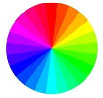
I can't decide if the image below is a blue or a blue-green monochromatic palette, I keep referring back to my color wheel and I'm leaning towards blue-green, what do you think?

The next two images I really had fun with finding. I wanted to display how easily going from one monochromatic scheme do the next could alter the way a room looks and the colors used in the room.
Below we have a room that has a monochromatic scheme built on yellow-orange (top) and one built on orange (bottom) TOTALLY DIFFERENT!
They also look different because the rooms vary in style, but there is no denying that the color difference is dramatic from one to the next.

 Ahhh the joy of color.
If you still hadn't found a combination of colors that you like...don't fret, I'll post about another theory tomorrow.
Catch ya'll later!

This first bedroom has shades and tints of red, pink, orange, and green. It reminds me of a delicious sorbet, and the look that's pulled off is quite yummy! The space also features a headboard that's reminiscent of a technique called trompe l'oeil (French for "trick the eye") in which an item is painted to look sort of three dimensional. This headboard is not quite as elaborate as most trompe l'oeil examples but pretty none the less.

Here are two more examples of the red/green complementary scheme...


Next lets explore the combination of violet and yellow, I must admit it's not my favorite but I think the designers who put together the rooms below did an excellent job. The first bedroom features rich eggplant purple walls with hint's of yellow for a tropical feeling. The wood used in this room also has strong yellow undertones adding to the complimentary color scheme.

The second bedroom featuring violet and yellow combine the colors in a more subdued manner, using lavender and a pale yellow almost taupe color.

Finally we have the blue-green/red-orange combination which I think is very fab! The first room is so nice I had to show you twice (two different views of the same room).

 This last room was featured in Domino's magazine and was submitted by one of their readers...I love it!
Images courtesy of Domino, Sunset, and House Beautiful.
We'll continue our journey through color theories with more posts throughout the week, until then...happy decorating!


The color palette for the office is black, white, and golden yellow. We'd already decided that we'd use a damask print as the pattern in the room. I hand painted each chair (with about 5 coats) of yellow paint, and recovered the seat cushions, it only took about two days, and that's including letting the paint dry, while I worked on other projects.
So check out the results...what do you think of the new twist on these traditional chairs?


I'll post even more pictures later this week, as I said this is just a sneak peek stay tuned for the entire room reveal.
How about one more teaser...

I'll show you where this project previewed above, found a home in the space.
 Check out the scoop back chair at West Elm.


Will you be using the shop by color feature?
 Are you blue this year? If so Pantone says you're right on the money because Blue Iris is Pantone's color of 2008.
